
Introduction
For many aspiring researchers, pursuing a PhD is a labor of love. Yet behind the passion for discovery lies a practical reality: PhD students need to pay rent, buy groceries, and manage the cost of living while dedicating years to their research. Understanding how stipends vary across universities, departments, and countries can help prospective students make informed decisions about where to pursue their graduate education.
In this analysis, I explore a dataset of PhD student salaries collected from phdstipends.com, examining how compensation varies by location, field of study, and time. Using R and the tidyverse, I cleaned and visualized data from over 9,000 observations to uncover patterns in graduate student compensation.
Key Findings
- The majority of respondents are from the USA; data collection from non-USA universities started in 2013
- Student stipends and living wage ratios are higher in the USA
- Stipends do not increase with years of experience in the program
- PhD stipends experienced a significant decrease around the 2008 financial crisis
- Compensation varies significantly between departments, with Business students earning the most and English students the least in US universities
The full code and analysis are available on GitHub.
Method
The dataset (version 7) was downloaded from Kaggle on 2020-07-12. It contains self-reported stipend information from PhD students worldwide, including their university, department, program year, overall pay, and living wage ratio.
Data Cleaning
initial_obs <- nrow(df)
glue("This datasets contain: {ncol(df)} variables and {nrow(df)} observations")
This datasets contain: 11 variables and 9273 observations.
Rename variables
df <- df %>%
    rename(Overall_Pay = `Overall Pay`,
           LW_Ratio = `LW Ratio`,
           Academic_Year = `Academic Year`,
           Program_Year = `Program Year`,
           Gross_Pay_12M = `12 M Gross Pay`,
           Gross_Pay_9M = `9 M Gross Pay`,
           Gross_Pay_3M = `3 M Gross Pay`
           )
Identify missing values
plot_missing(df)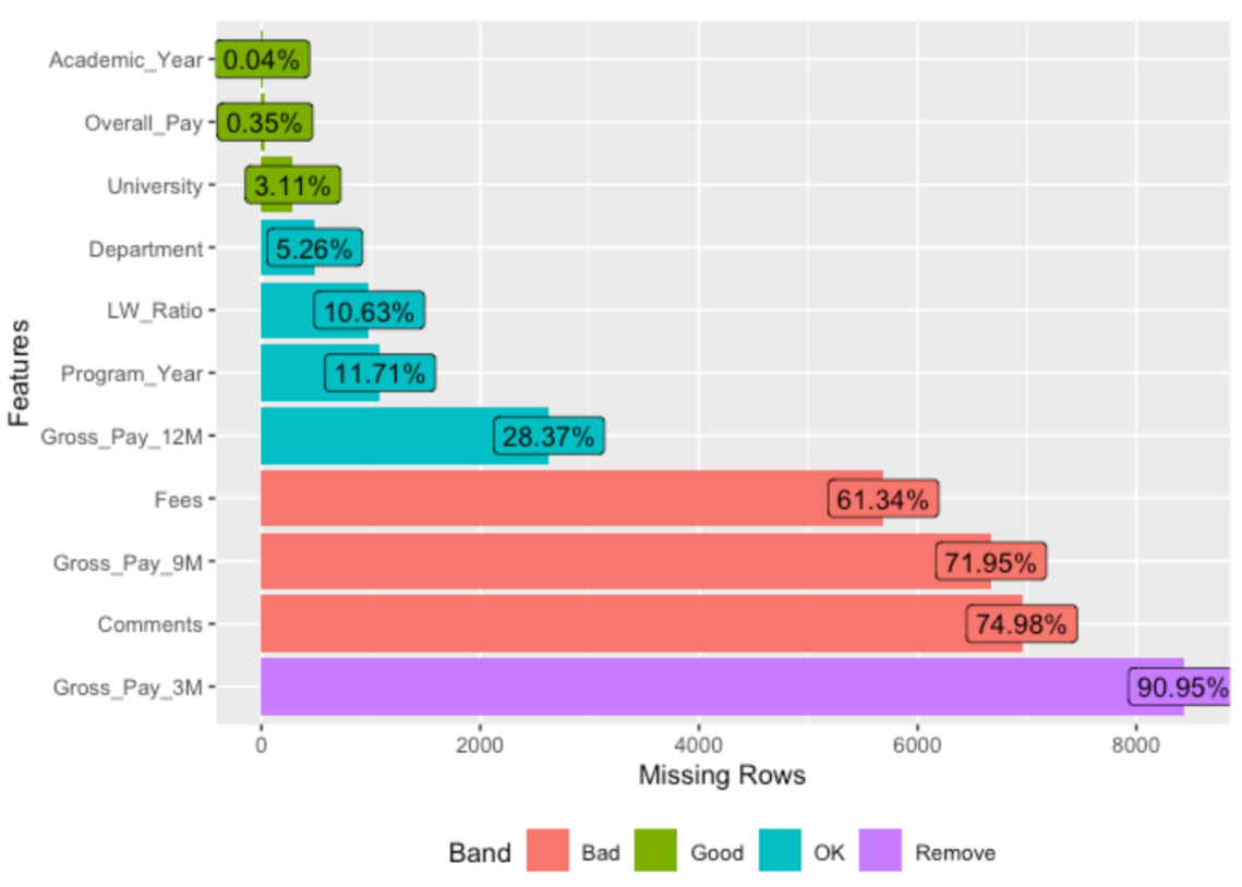
The variables with a majority of missing values are excluded from the rest of the analysis.
df <- df %>% select(-c('Fees', 'Gross_Pay_9M', 'Comments', 'Gross_Pay_3M'))Convert Salary to numeric
# See https://stackoverflow.com/questions/10294284/remove-all-special-characters-from-a-string-in-r

df$Overall_Pay <- str_replace_all(df$Overall_Pay, "[[:punct:]]", "")
df$Overall_Pay <- str_replace_all(df$Overall_Pay, "[[$]]", "")
df$Overall_Pay <- as.numeric(df$Overall_Pay)

df$Gross_Pay_12M <- str_replace_all(df$Gross_Pay_12M, "[[:punct:]]", "")
df$Gross_Pay_12M <- str_replace_all(df$Gross_Pay_12M, "[[$]]", "")
df$Gross_Pay_12M <- as.numeric(df$Gross_Pay_12M)

p1 <- ggplot(df) +
    aes(x = Overall_Pay)+
    geom_density(fill = "#E69F00", alpha = 0.7)

p2 <- ggplot(df) +
    aes(x = LW_Ratio)+
    geom_density(fill = "#E69F00", alpha = 0.7)

p1 / p2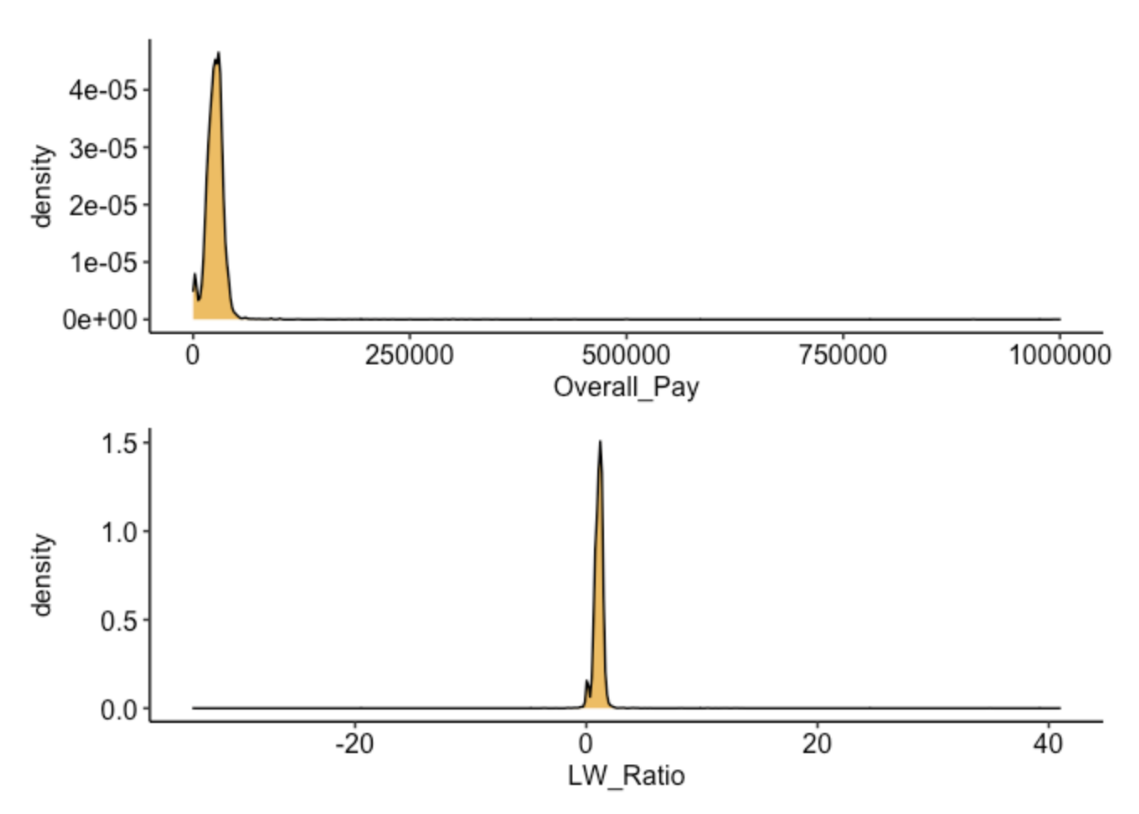
After researching PhD salaries in the US, typical stipends range between $15K and $35K. Therefore, salaries above $50K are likely entry errors. Salaries under $15K could be legitimate cases and will be examined separately.
Convert Program Year to numeric
# This variable could be considered both as categorical and continuous
# I will create 2 variables for data analysis and visualisation

df$Program_Year <- str_replace_all(df$Program_Year, "1st", "1")
df$Program_Year <- str_replace_all(df$Program_Year, "2nd", "2")
df$Program_Year <- str_replace_all(df$Program_Year, "3rd", "3")
df$Program_Year <- str_replace_all(df$Program_Year, "4th", "4")
df$Program_Year <- str_replace_all(df$Program_Year, "5th", "5")
df$Program_Year <- str_replace_all(df$Program_Year, "6th and up", "6")

df$Seniority_Year <- as.numeric(df$Program_Year)
Convert Academic Years to factor
# https://cran.r-project.org/web/packages/stringr/vignettes/regular-expressions.html

df$Academic_Year <- str_replace_all(df$Academic_Year, "-....", "")

df$Academic_Year <- as.Date(df$Academic_Year, "%Y")

# After conversion all year start on the 07-12 need to change for first September

df$Academic_Year <- as.character(df$Academic_Year)
df$Academic_Year <- str_replace_all(df$Academic_Year, "-07-18", "-01-09")
df$Academic_Year <- as.Date(df$Academic_Year)
Universities locations
By manual inspection we can identify a subset of non-American universities which represent the majority of this data set. In order to compare US and non-US salaries I created an Excel file to differentiate salaries by locations.
# Export universities names

university_names <- data.frame(unique(df$University))

# Order the names by alphabetic order

university_names <- university_names %>%
    arrange(unique.df.University.)

# Number of Universities
nrow(university_names)

file_path <- file.path(output_directory,"universities_names.csv")
write_csv(university_names, file_path)

# Add us - non-us category
univ_locations <- read_xlsx(path = "Data/univ_location.xlsx", sheet=3)
df <- inner_join(df, univ_locations, by="University")
Edit departments names
Several identical departments have different spellings in the data set. Using stringr I corrected these differences in order to identify the most common departments and the associated salaries.
df$department_cleaned <- df$Department

# https://stringr.tidyverse.org/articles/regular-expressions.html

# Convert to lower case
df$department_cleaned <- tolower(df$department_cleaned)

# n/a to NA
df <- df %>%
    filter(!is.na(department_cleaned)) %>%
    filter(department_cleaned != "n/a")

# Group all bioscience related department to biology
df$department_cleaned <- str_replace_all(df$department_cleaned, ".{0,}bio.{0,}", "biology")
df$department_cleaned <- str_replace_all(df$department_cleaned, ".{0,}cell.{0,}", "biology")
df$department_cleaned <- str_replace_all(df$department_cleaned, ".{0,}molecular.{0,}", "biology")
df$department_cleaned <- str_replace_all(df$department_cleaned, ".{0,}neuro.{0,}", "biology")
df$department_cleaned <- str_replace_all(df$department_cleaned, ".{0,}genetics.{0,}", "biology")

# Group all aerospace department
df$department_cleaned <- str_replace_all(df$department_cleaned, ".{0,}aero.{0,}", "aerospace")
df$department_cleaned <- str_replace_all(df$department_cleaned, ".{0,}space.{0,}", "aerospace")

# Group all health departments
df$department_cleaned <- str_replace_all(df$department_cleaned, ".{0,}health.{0,}", "health")
df$department_cleaned <- str_replace_all(df$department_cleaned, ".{0,}medical.{0,}", "health")
df$department_cleaned <- str_replace_all(df$department_cleaned, ".{0,}clinical.{0,}", "health")
df$department_cleaned <- str_replace_all(df$department_cleaned, ".{0,}pharmacy.{0,}", "health")

# Group all chemistry dept
df$department_cleaned <- str_replace_all(df$department_cleaned, ".{0,}chemical.{0,}", "chemistry")
df$department_cleaned <- str_replace_all(df$department_cleaned, ".{0,}chemistry.{0,}", "chemistry")

# Group all Computer Science dept
df$department_cleaned <- str_replace_all(df$department_cleaned, ".{0,}comput.{0,}", "computer science")
df$department_cleaned <- str_replace_all(df$department_cleaned, "^computational.{0,}", "computer science")

# Group all Psychology dept
df$department_cleaned <- str_replace_all(df$department_cleaned, ".{0,}psych.{0,}", "psychology")

# Group all comm. dept
df$department_cleaned <- str_replace_all(df$department_cleaned, ".{0,}communication.{0,}", "communication")

# Group all physic departments
df$department_cleaned <- str_replace_all(df$department_cleaned, ".{0,}physics.{0,}", "physics")

# Group all agriculture dept
df$department_cleaned <- str_replace_all(df$department_cleaned, ".{0,}agri.{0,}", "agriculture")
df$department_cleaned <- str_replace_all(df$department_cleaned, ".{0,}crop.{0,}", "agriculture")
df$department_cleaned <- str_replace_all(df$department_cleaned, ".{0,}plant.{0,}", "agriculture")

# Group all engineering dept
df$department_cleaned <- str_replace_all(df$department_cleaned, ".{0,}engineering.{0,}", "engineering")
df$department_cleaned <- str_replace_all(df$department_cleaned, ".{0,}mechanical.{0,}", "engineering")

# Group all business dept
df$department_cleaned <- str_replace_all(df$department_cleaned, ".{0,}business.{0,}", "business")

# Group all math dept
df$department_cleaned <- str_replace_all(df$department_cleaned, ".{0,}math.{0,}", "mathematics")

# Group all criminology dept
df$department_cleaned <- str_replace_all(df$department_cleaned, ".{0,}crim.{0,}", "criminology")

# Group all geoscience dept
df$department_cleaned <- str_replace_all(df$department_cleaned, ".{0,}earth.{0,}", "geoscience")
df$department_cleaned <- str_replace_all(df$department_cleaned, ".{0,}geo.{0,}", "geoscience")

# Group all english dept
df$department_cleaned <- str_replace_all(df$department_cleaned, ".{0,}english.{0,}", "english")

# List department with at least 50 students
top_dept <- df %>%
    group_by(department_cleaned) %>%
    count() %>%
    arrange(desc(n)) %>%
    filter(n >= 50) %>%
    pull(department_cleaned)
Filter observations
Excludes observations with:
- missing Overall Pay
- Overall Pay above $50K which are likely entry errors
- missing LW ratio
- missing Universities
- missing Program Year
df <- df %>%
    filter(!(is.na(Overall_Pay))) %>%
    filter(Overall_Pay <= 50000) %>%
    filter(!is.na(LW_Ratio)) %>%
    filter(!(is.na(Program_Year)))
Data Visualisation
Compare salaries and living wage ratio by locations
p1 <- df %>%
    filter(Overall_Pay > 15000) %>%
    ggplot() +
    aes(x = location, y = Overall_Pay, fill = location) +
    geom_boxplot(varwidth = TRUE, notch = TRUE) +
    scale_fill_manual(values=c("us" = "#CC6666", "non_us" = "#9999CC"))

p2 <- df %>%
    filter(Overall_Pay > 15000) %>%
    ggplot() +
    aes(x = location, y = LW_Ratio, fill = location) +
    geom_boxplot(varwidth = TRUE, notch = TRUE) +
    scale_fill_manual(values=c("us" = "#CC6666", "non_us" = "#9999CC"))

p1 | p2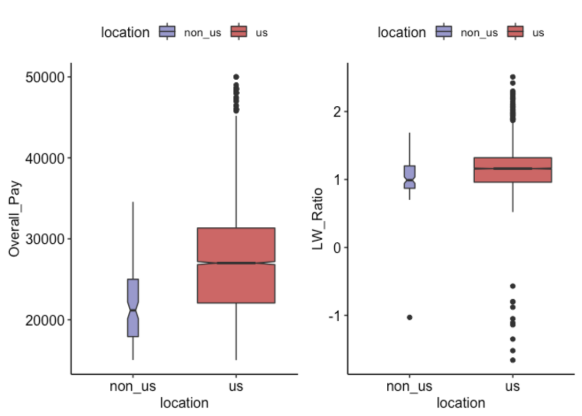
We can see on this figure that:
- A majority of observations are from US universities
- The overall pay and living wage ratios are significantly higher in US universities
How many students are paid less than $15K? Are they located outside the USA?
# https://stackoverflow.com/questions/26553526/how-to-add-frequency-count-labels-to-the-bars-in-a-bar-graph-using-ggplot2

p1 <- df %>%
    filter(Overall_Pay <= 15000) %>%
    group_by(location) %>%
    ggplot() +
    aes(x = location, fill = location) +
    geom_bar(width = 0.5) +
    scale_fill_manual(values=c("us" = "#CC6666", "non_us" = "#9999CC")) +
    geom_text(stat='count', aes(label=..count..), vjust=-0.2) +
    ggtitle("student under $15K")

p2 <- df %>%
    filter(Overall_Pay > 15000) %>%
    group_by(location) %>%
    ggplot() +
    aes(x = location, fill = location) +
    geom_bar(width = 0.5) +
    scale_fill_manual(values=c("us" = "#CC6666", "non_us" = "#9999CC")) +
    geom_text(stat='count', aes(label=..count..), vjust=-0.2) +
    ggtitle("student over $15K")

p1 | p2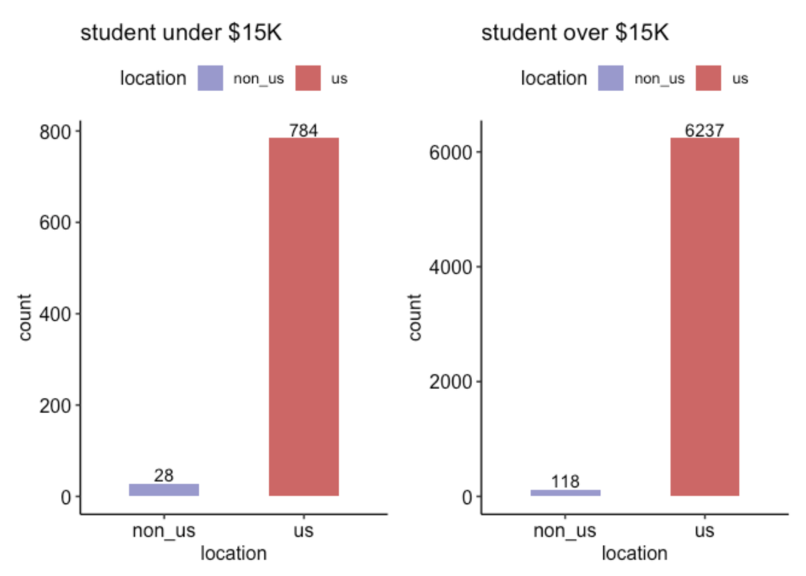
Salary per seniority
p1 <- df %>%
    filter(Overall_Pay > 15000) %>%
    ggplot() +
    aes(x = Program_Year, fill = Program_Year) +
    geom_bar() +
    scale_fill_manual(values = palette)

p2 <- df %>%
    filter(Overall_Pay > 15000) %>%
    mutate(log_Overall_Pay = log10(Overall_Pay)) %>%
    ggplot() +
    aes(x = Program_Year, y = log_Overall_Pay, fill = Program_Year) +
    geom_boxplot(notch = TRUE) +
    scale_fill_manual(values = palette) +
    guides(fill=FALSE)

p3 <- df %>%
    filter(Overall_Pay > 15000) %>%
    ggplot() +
    aes(x = Program_Year, y = LW_Ratio, fill = Program_Year) +
    geom_boxplot(notch = TRUE) +
    scale_fill_manual(values = palette) +
    guides(fill=FALSE)

(p1 | plot_spacer()) / (p2 | p3)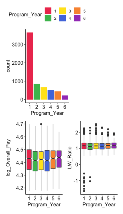
We can see on this figure that:
- The majority of respondents are in their first year
- The program year is not linked to the Overall Pay or to the Living Wage ratios
Pay and Living wage ratio over time
p1 <- df %>%
    filter(!(is.na(Overall_Pay))) %>%
    filter(location %in% c('us', 'non_us')) %>%
    filter(Overall_Pay > 15000) %>%
    filter(!(is.na(Academic_Year))) %>%
    group_by(Academic_Year, location) %>%
    summarise(mean_Overall_Pay = mean(Overall_Pay)) %>%
    ggplot() +
    aes(x=Academic_Year, y=mean_Overall_Pay, group=location, colour=location ) +
    scale_color_manual(values=c("us" = "#CC6666", "non_us" = "#9999CC")) +
    geom_line(size=1) +
    geom_vline(xintercept = as.Date("2013-01-09"), linetype="dotted", color = "black", size=0.5) +
    geom_vline(xintercept = as.Date("2015-01-09"), linetype="dotted", color = "black", size=0.5)

p2 <- df %>%
    filter(!(is.na(Overall_Pay))) %>%
    filter(location %in% c('us', 'non_us')) %>%
    filter(Overall_Pay > 15000) %>%
    filter(!(is.na(Academic_Year))) %>%
    group_by(Academic_Year, location) %>%
    summarise(mean_LW_Ratio = mean(LW_Ratio)) %>%
    ggplot() +
    aes(x=Academic_Year, y=mean_LW_Ratio, group=location, colour=location ) +
    scale_color_manual(values=c("us" = "#CC6666", "non_us" = "#9999CC")) +
    geom_line(size=1) +
    geom_vline(xintercept = as.Date("2013-01-09"), linetype="dotted", color = "black", size=0.5) +
    geom_vline(xintercept = as.Date("2015-01-09"), linetype="dotted", color = "black", size=0.5)

p1 / p2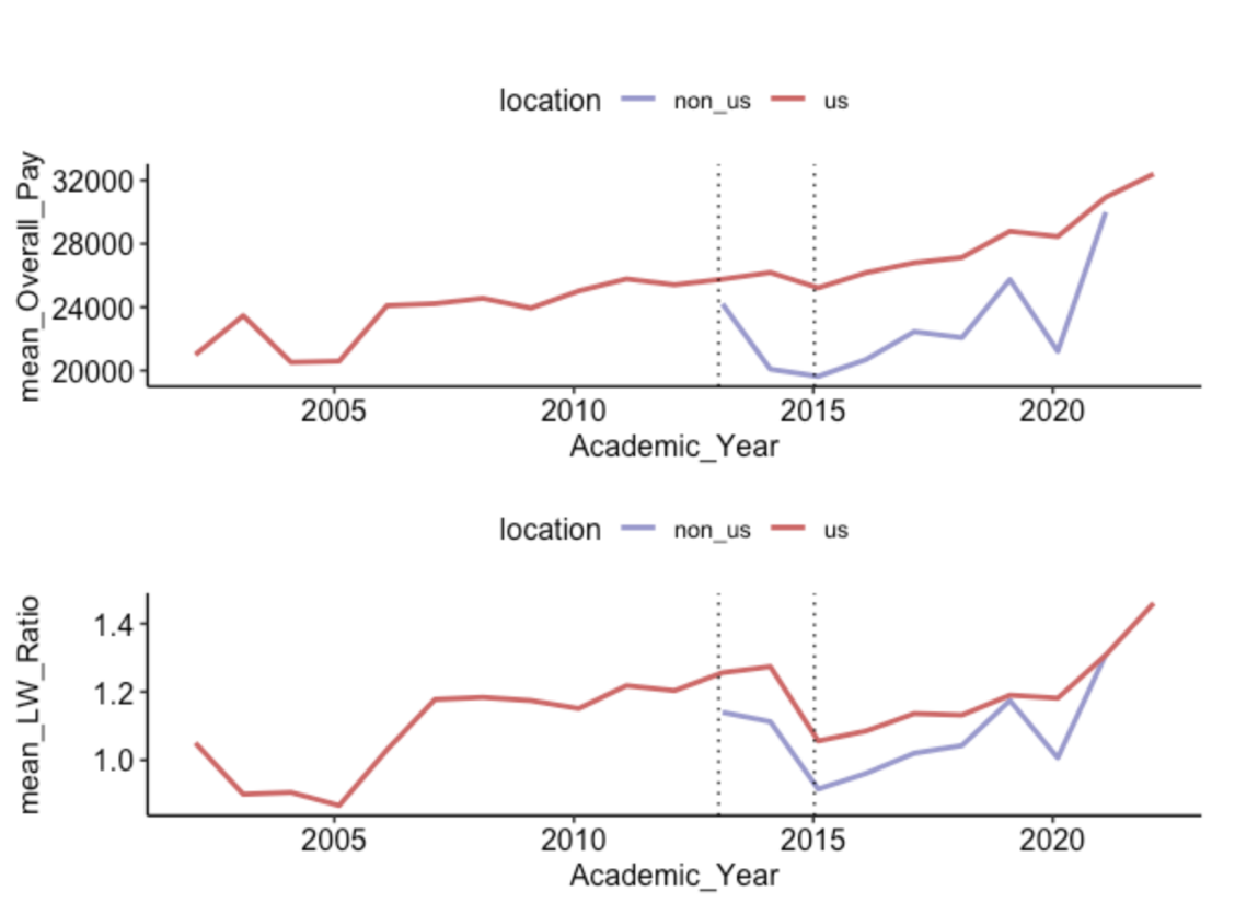
We can see on this figure that:
- Non-US universities were included in the data set after 2013
- The mean Overall Pay has been increasing over time
- The living wage ratios however have decreased internationally after 2014
Overall Pay and Living wage by department
df$department_cleaned <- as.factor(df$department_cleaned)

# US universities
p1 <- df %>%
    filter(department_cleaned %in% top_dept) %>%
    filter(location == 'us') %>%
    filter(Overall_Pay > 15000) %>%
    group_by(department_cleaned) %>%
    summarise(mean_Overall_Pay = mean(Overall_Pay)) %>%
    mutate(department_cleaned = fct_reorder(department_cleaned , mean_Overall_Pay)) %>%
    ggplot() +
    aes(x = department_cleaned, y = mean_Overall_Pay, fill = location) +
    coord_flip() +
    geom_bar(stat = "identity", fill = "#CC6666")

p2 <- df %>%
    filter(department_cleaned %in% top_dept) %>%
    filter(location == 'us') %>%
    filter(Overall_Pay > 15000) %>%
    group_by(department_cleaned) %>%
    summarise(mean_LW_Ratio = mean(LW_Ratio)) %>%
    mutate(department_cleaned = fct_reorder(department_cleaned , mean_LW_Ratio)) %>%
    ggplot() +
    aes(y = department_cleaned, x = mean_LW_Ratio, fill = location) +
    geom_bar(stat = "identity", fill = "#CC6666")

(p1 | p2) +  plot_annotation(title = 'Pay by department in US universities')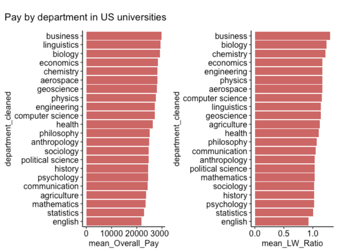
# Non-US universities
p1 <- df %>%
    filter(department_cleaned %in% top_dept) %>%
    filter(!(is.na(Overall_Pay))) %>%
    filter(location == 'non_us') %>%
    filter(Overall_Pay > 15000) %>%
    group_by(department_cleaned) %>%
    summarise(mean_Overall_Pay = mean(Overall_Pay)) %>%
    mutate(department_cleaned = fct_reorder(department_cleaned , mean_Overall_Pay)) %>%
    ggplot() +
    aes(x = department_cleaned, y = mean_Overall_Pay, fill = location) +
    coord_flip() +
    geom_bar(stat = "identity", fill = "#9999CC")

p2 <- df %>%
    filter(department_cleaned %in% top_dept) %>%
    filter(!(is.na(Overall_Pay))) %>%
    filter(location == 'non_us') %>%
    filter(Overall_Pay > 15000) %>%
    group_by(department_cleaned) %>%
    summarise(mean_LW_Ratio = mean(LW_Ratio)) %>%
    mutate(department_cleaned = fct_reorder(department_cleaned , mean_LW_Ratio)) %>%
    ggplot() +
    aes(y = department_cleaned, x = mean_LW_Ratio, fill = location) +
    geom_bar(stat = "identity", fill = "#9999CC")

(p1 | p2) + plot_annotation(title = 'Pay by department in non-US universities')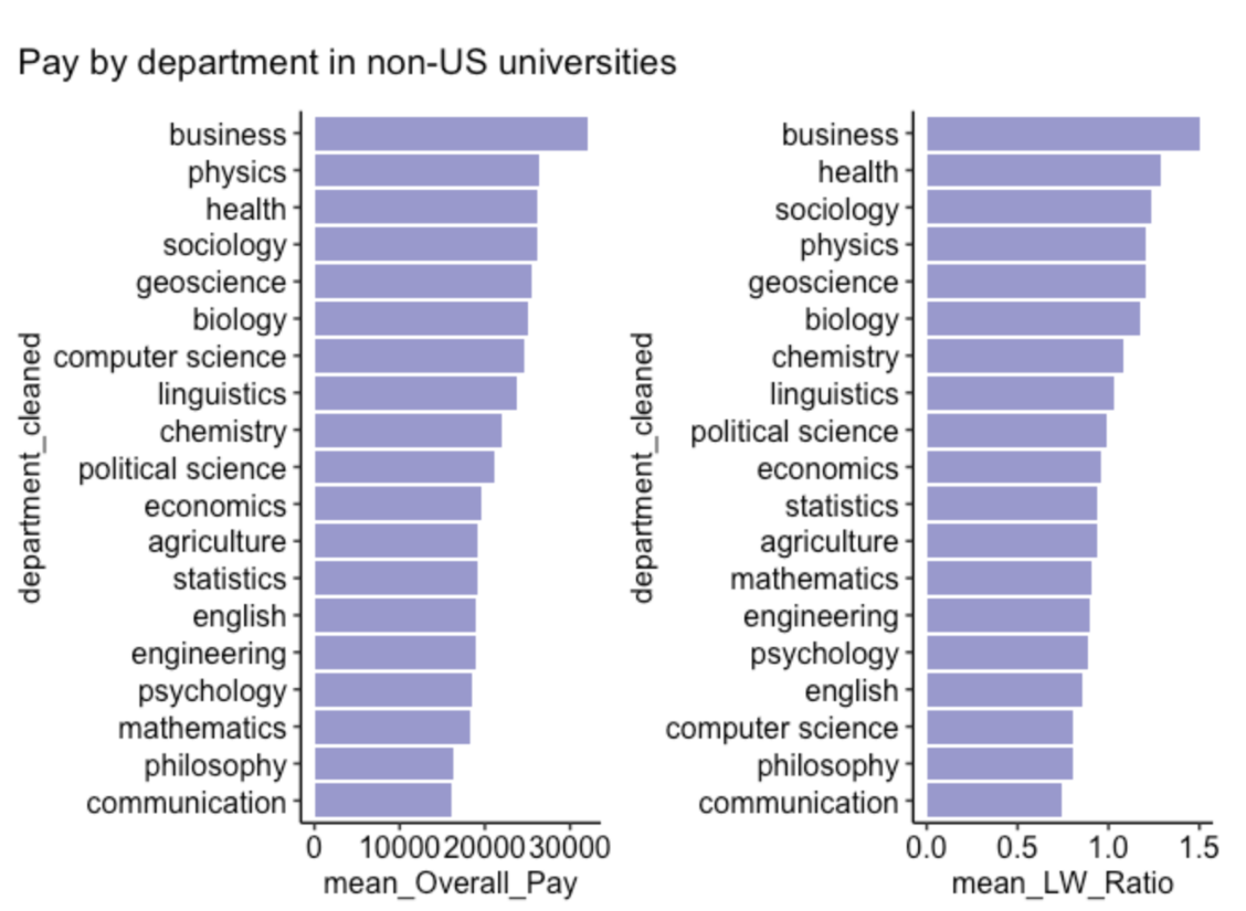
We can see on this figure that:
- The difference in pay by department is slight in the USA
- English students are the lowest paid in the USA
- Business students are the best paid in the USA
- The pay differences are more marked in non-US universities
- Healthcare students are the best paid in non-US universities
- Communication students are the least paid in non-US universities
Conclusions
Data collection improvement
This data set required extensive data cleaning on salaries, universities and department names. The quality of the analysis could be improved by improving the questionnaires filled by students to ensure that:
- Salaries are entered as numbers
- Department choices are entered in a drop-down menu
- More international data are collected
Principal findings
- The Overall Pay and Living Wage ratio is higher in the USA
- PhD students Living Wage ratios have decreased internationally since 2013
- Living Wages ratios started to increase again after 2015
- Business students are the best paid in the USA
- English students have the lowest pay in the USA
Future studies
The following areas could be explored further:
- Compare LW ratio to professional salaries for each given department
- Compare LW ratio to average student debt by countries
- Compare salaries to inflation in the USA